In an uptrend as price breaks up through prior system highs, blue heatmap cells are generated; in a downtrend, as price falls through prior system lows, red cells. (Figure 1).

A trend reversal is indicated by a colour change and has stricter conditions. Price must break through a predetermined system low (for a down reversal) or system high (for up reversal). Because it is harder for the system to reverse than continue, a lot of noise is stripped away, the trend is easier to visualise and you are kept in. Furthermore, you know these reversal levels in advance, which means they can also serve as stops.
Colour tone is determined by a composite momentum indicator. The stronger the trend power, the stronger the colour and conviction. Pale reds and blues indicate low volatility, weak momentum regimes (which imply small position size) whereas strengthening colours show building trend power (larger position size).
Easy to visualise blue and red colour regimes make pattern recognition using the heatmap very effective. New users looking for a trading opportunity tend to scroll through the heatmap and immediately alight on a row where a colour change has just occurred (for example a red phase gives way to a single blue cell at the last date). The assumption being that a new meaningful uptrend phase could have just begun.
While it is true that a profitable uptrend phase has to start with an initial blue cell, it is often wiser to assess context before taking the signal. This is at the heart of pattern recognition. A full video on many common colour patterns has been produced and a pattern backtest is being undertaken. But for now, here is some basic guidance:
If you are set to daily data, toggle to weekly in the left toolbar on the heatmap page to check consistency: do we see similar strong recent blue cells? Are the two time series in gear? If so it suggests that any weakness on the daily timeframe will get absorbed by the bid on the longer timeframe.
Rather than just chase strength willy-nilly, either wait for a pale red phase to come and go and take the first blue out of it - trade out of an uptrend refresh (Figure 2) - or at the minimum wait for the next very strong blue cell and then trade the first pale blue out of that - momentum thrust and minor pullback (Figure 3).
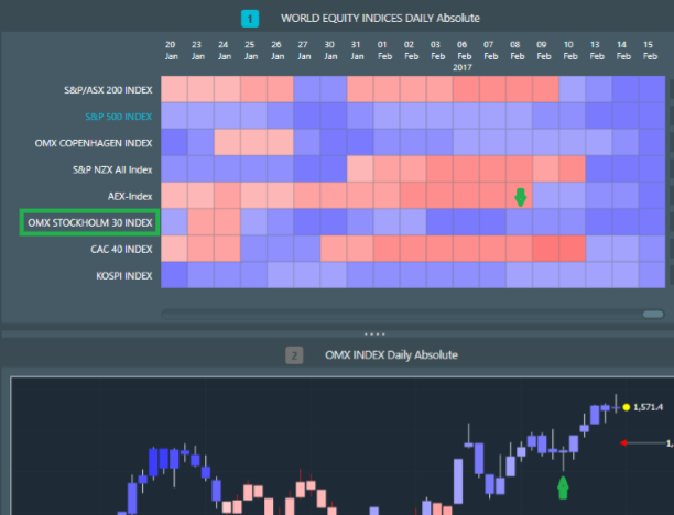
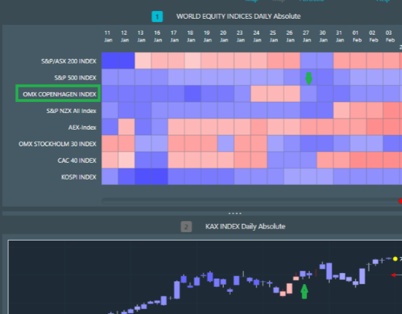
One way to use context to help anticipate the end of a decline is by observing a gradual strengthening of red colours. In Figure 4 we see strong blue cells on 6-11 November give way to pale red cells which gradually strengthen in tone to the final strong red on 9 February in Figure 5.
The last block of strong reds can be interpreted as a steep capitulation move. The switch to light blue cells on 10-13 February which then strengthen up in tone on 14 February, is an indication that the new uptrend phase has developing power after sellers have been washed out .


Figure 6 is an example of a strong red capitulation cell on 18 November basis weekly data. You can use the scroll bar at the bottom of the heatmap to see how the downtrend has been developing (in this case it began at the end of June 2016). The strong red on the 18th followed by two paler reds and then a blue upside reversal is contextual evidence that a meaningful reversal had taken place. You would have been safe to surmise as much on 16 December. This is weekly, so you could also have toggled down to the daily timeframe for more granularity.

Another clue that an upside reversal is likely to be meaningful is when, after a sustained red down phase, you observe strong reds giving way to paler reds ahead of a switch to blue.
This indicates that downside momentum is abating and is equivalent to a bullish reversal in RSI (namely, price makes lower closes as RSI pushes higher). Figure 7 shows just that and the blue cell on 2 September at the time would have therefore been given more credence.
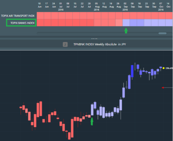
Any trend following system, such as the one underlying RotationProTM, suffers from false positives. Attempting to completely smooth these out creates the bigger drawback of truncating your trending phases. The compromise is always between system sensitivity and the occasional misleading signal. In a false positive, a new trend looks to be starting up, but then quickly fades out. Or else, a trend is in progress and is interrupted briefly by one or a few opposite colour cells.
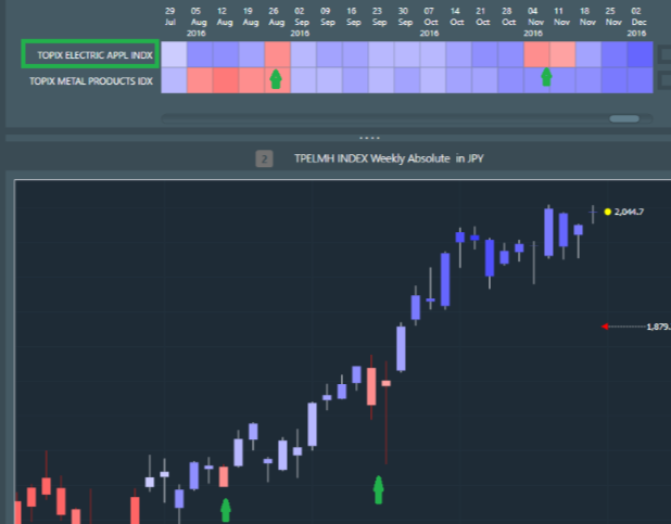
Typically the colour tone for these minor excursions is pale (low conviction, small position size) and in fact they can greatly assist contextual understanding. In Figure 8 weekly data for Topix Electrical Appliances shows two occasions where strong blues give way to brief pale reds and then revert back to blue. Because the prior blues are strong (firm upside momentum) and the reds are pale, we interpret these as reinvigorating rest stages, which add to conviction in the uptrend.
As a rule of thumb, three is the charm. If you see three brief red interruptions in a sustained blue phase, especially if the last is stronger red then this is a potential upside exhaustion signal. The same principle applies to brief pale blue interruptions in a sustained red regime.
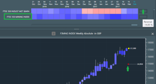
The progress bars to the right of the heatmap indicate how far away price is from a reversal (up trending blue to down trending red or vice versa, red to blue). The colour of the progress bar matches the colour of the heatmap cell once a reversal has occurred. The system lets you know the reversal level in advance. This makes it a good place for a stop but it also gives you a clue as to the robustness of the trend.
An empty progress bar shows that a colour change reversal is a low probability; a full progress bar shows that a reversal is imminent; a flashing full reversal bar means that a reversal is underway.
Figure 9 shows the FTSE Mining Sector - strong blues, empty progress bar, hover over it to see how far away in percentage terms is the reversal level (blue to red here), look at the chart and the red triangle marks the reversal level in price terms. The combination points to a robust uptrend.
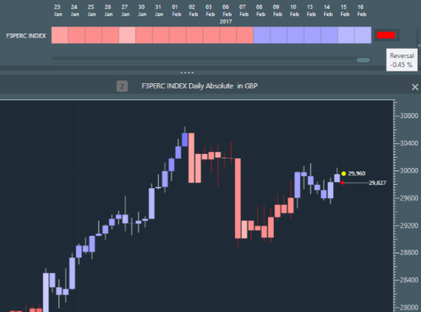
The example in Figure 10 shows a nearly full red progress bar indicating that a downside reversal is imminent. Hovering over the bar tells us it is 0.45% lower and glancing across to the chart we can see the price value of the reversal and confirm its proximity to current price (next to the yellow dot). Note also that the row of blue cells from 8 February became paler from the 15th, indicating that upside momentum has started to falter. The takeaway here is that the sector is in a precarious position and could easily reverse down soon.
Toggling from absolute data to relative in the left toolbar on the heatmap page allows you to assess whether a security is out or underperforming an index. Figure 11 is a snapshot of the strongest Japanese equity sectors relative to the broad market (Topix Index) basis weekly data. The pattern we see in the Insurance sector is informative: a sequence of strong and very strong blues from 11 November to 6 January tells us that a robust uptrend was in place. Then a pale red set until 10 February, which is clearly an uptrend refresh phase - and note the last red cell is even paler, telling us that downside momentum softened here. Then straight back into the uptrend with a strong high momentum blue breakout cell. Note also the empty progress bar showing a low probability of downside reversal on this timeframe. Having quickly found an outperforming sector, you can now drill down into the individual members to identify the sector outperformers.
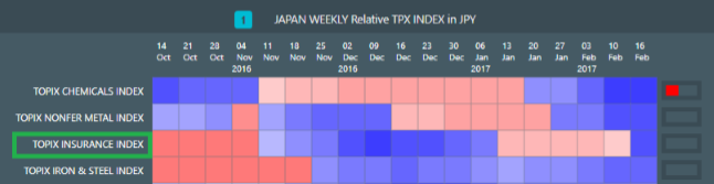
Toggling from absolute data to relative in the left toolbar on the heatmap page allows you to assess whether a security is out or underperforming an index. Figure 11 is a snapshot of the strongest Japanese equity sectors relative to the broad market (Topix Index) basis weekly data. The pattern we see in the Insurance sector is informative: a sequence of strong and very strong blues from 11 November to 6 January tells us that a robust uptrend was in place. Then a pale red set until 10 February, which is clearly an uptrend refresh phase - and note the last red cell is even paler, telling us that downside momentum softened here. Then straight back into the uptrend with a strong high momentum blue breakout cell. Note also the empty progress bar showing a low probability of downside reversal on this timeframe. Having quickly found an outperforming sector, you can now drill down into the individual members to identify the sector outperformers.
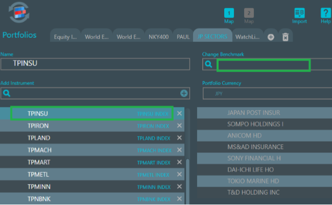
Figure 12 shows the Insurance sector highlighted and note that the benchmark is now the sector itself, enabling us to identify sector outperformers (simply type TPINSU Index in Change benchmark and hit the plus sign). Then hit Map 1 to run the list which returns you to heatmap view.
Having run the Japanese insurance list relative to the sector Figure 13 highlights two sector relative potential opportunities. Tokio Marine (which is also charted) appears to be emerging from a persistent sector relative red down phase - although I would prefer to see these blue cells start darkening soon. Meanwhile, Japan Post looks to have entered a sector underperform phase.
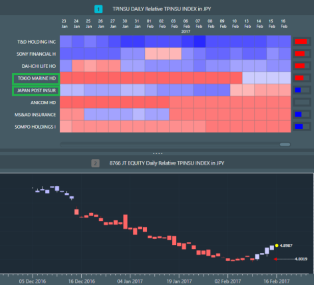
Toggling to absolute data and selecting the Tokio Marine row the sector looks to be in a developing upswing (strengthening blues from 14 February and empty progress bar). So in this exercise we have drilled down from the Japanese Insurance sector, which we like on the long side for its market outperformance mode, Tokio Marine as an early stage potential sector outperformer and Tokio Marine absolute price action as depicted by the heatmap. This would have taken a lot longer even for a competent technical analyst just looking at charts.
Figure 12 shows the Insurance sector highlighted and note that the benchmark is now the sector itself, enabling us to identify sector outperformers (simply type TPINSU Index in Change benchmark and hit the plus sign). Then hit Map 1 to run the list which returns you to heatmap view.

In the case that you are able to pick any stock globally, the first step is to zero in on a preferred market. In portfolio view choose the default World Equity Indices list within the World Equity tab (in the row of tabs at the top of the screen). Because this is a multi currency list, set the currency to
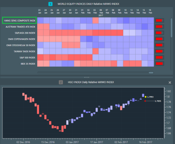
The Hang Seng Index is currently leading relative world equities benchmark and entered a new blue uptrend phase on 6 February. There is a default Hong Kong sectors watch list in the Equity Index Sectors tab, so pulling that list up and toggling to relative (HSCI Index) Figure 16 shows the Hang Seng IT sector basis weekly data having merit as a further market outperformer: strong blue regime to 11 November, followed by uptrend refresh red phase to 30 December and new blue regime from 6 January. Note the strong blue momentum thrust 20-27 January (robust uptrend confirmation) and the pale blue at last date offering a chance to enter Long on softness. The progress bar is also only 30% full, indicating that a downside reversal here (relative HSCI) is a lower probability outcome.